LOKAL: When the Product Is Bigger Than What Is Known About It
01.07.2026
READING TIME 9 MINUTES
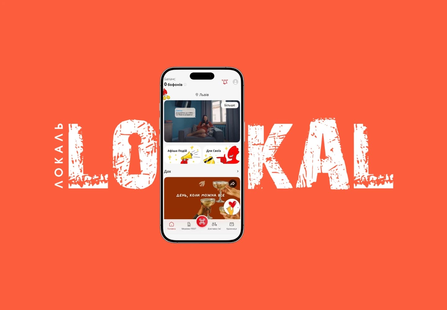
LOKAL - one of the largest loyalty programs in Ukraine: around 2 million members and over 500,000 downloads of the mobile application, which combines a bonus system, payments at venues, and a rewards catalog.
Context
LOKAL - one of the largest loyalty programs in Ukraine: around 2 million members and over 500,000 downloads of the mobile application, which combines a bonus system, payments at venues, and a rewards catalog.
challenge
The LOKAL team wanted to test their product, as their product team had accumulated many hypotheses about how the user behaves. The request sounded simple: to look at the application through the eyes of those who use it, to test UX/UI assumptions, and to obtain a basis for future decisions.
solution
The first thing we insisted on before the study – was to divide the research into two segments: "Typical" and "Most Active". A "typical" user and a "most active" user use the application differently: what is an almost daily ritual for one – is completely out of sight for the other. Therefore, we split the audience into two large-scale segments and wrote a separate script for each. Closed questions provided numbers – what they open, what they use, where they find their way around, and where they have a blind spot. Open questions gave them a voice: a huge array of comments was analyzed and coded into themes, with pain points, requests, and live quotes. And where a suspicious gap appeared between "I use" and "I would use", we tested the connection statistically to distinguish a pattern from coincidence. We also studied users in the "Lost" segment, but too few responses were collected for representativeness, so we only did a content analysis of the open-ended answers and extracted a few insights.
What we learned and applied
This became the main shift in perspective. The request started as "let's tweak the UX," but the study showed that the biggest reserve for growth – is not in the buttons, but in the very role of the product: what LOKAL means to a person and how it communicates with them. The team took on the broader question of the application's meaning and place within the !FEST ecosystem. As the colleagues themselves wrote: the most valuable result was the understanding that LOKAL needs not only UX/UI improvements, but a reinterpretation of the product and new meanings for interacting with it.
result
And here is what was revealed.
First of all – people love LOKAL and !FEST.
The absolute majority of open answers are warm or neutral; alongside the "silent majority", there is an entire active core that brings ideas on its own.
And when they do criticize, their pain is not about the price or the service, but about the application itself in small details, for example: "it is difficult to find the card while standing in line at the checkout." The app itself, meanwhile, is perceived primarily as a loyalty tool: guests open it first and foremost for bofons, coupons, and promotions, while the map or news remain in the background.
But the most interesting part was not what people say, but what is hidden behind the numbers.
It turned out that a lot of value in the app is simply...
invisible.
A significant portion of users cannot find or do not understand individual tabs; more than half do not know about the referral program; only a minority use the interactive map.
At first, this reads as "features do not work." But here we see the opposite: when we described the map with useful filters ("with kids", "pets allowed", "parking") to people, the absolute majority said they would use it.
Statistics confirmed what was felt intuitively: the more a person knows about a feature, the more valuable it seems to them – among those well-informed, maximum ratings of usefulness were the norm, while among the uninformed, they were isolated.
That means the problem is not in the design of the button.
The problem is that people simply did not find out about the good things inside the app.
// ready to start?
